Kuniko's Teriyaki
Kuniko's Teriyaki
Redesigning A Menu
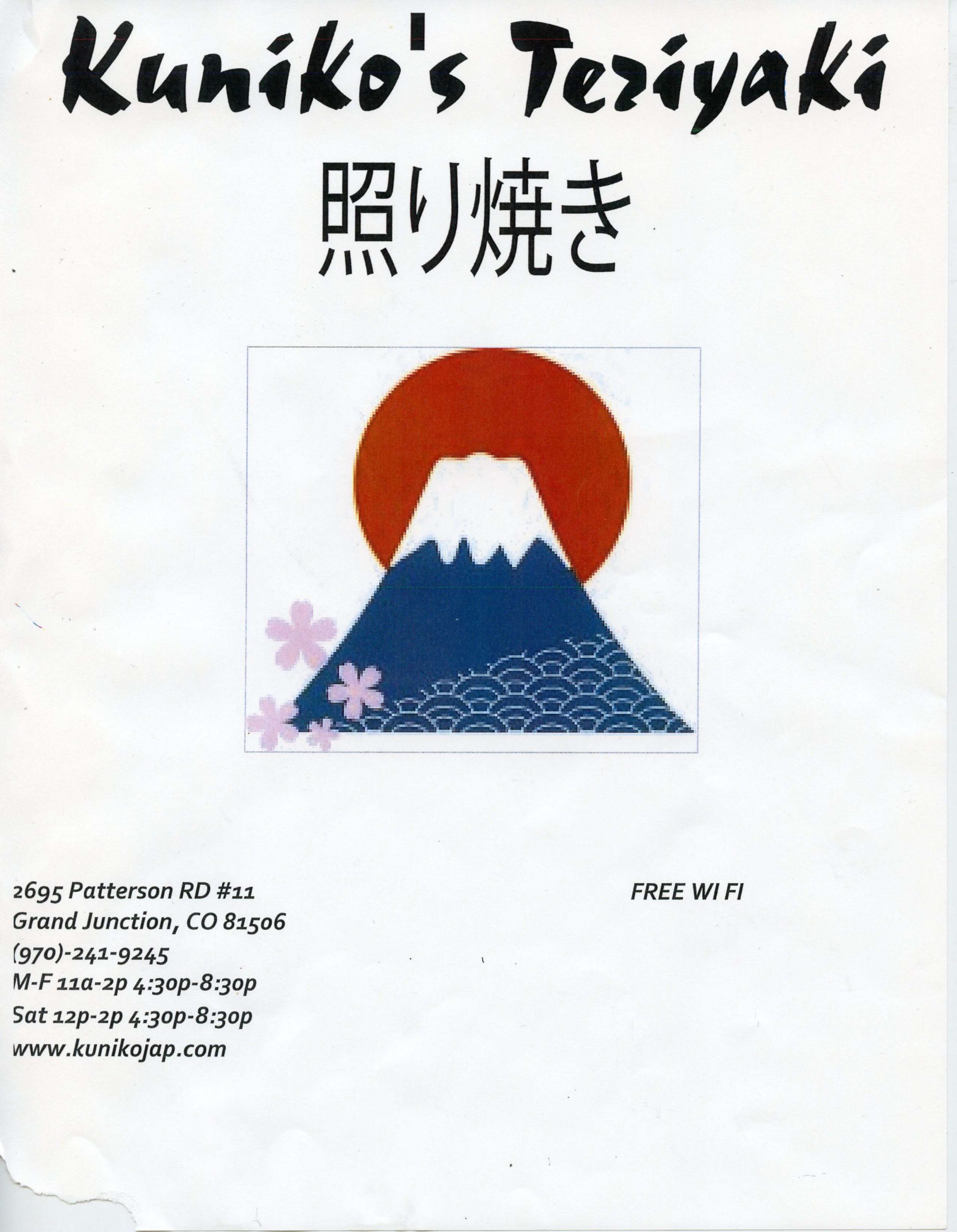
Taking an old menu design and creating an idea for a new look.
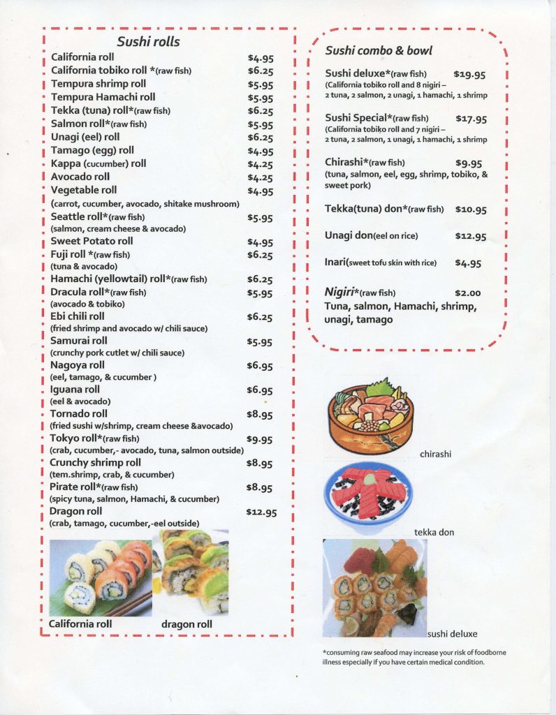
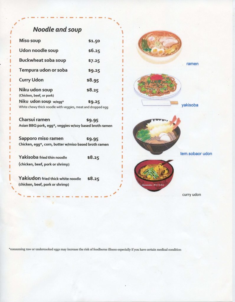
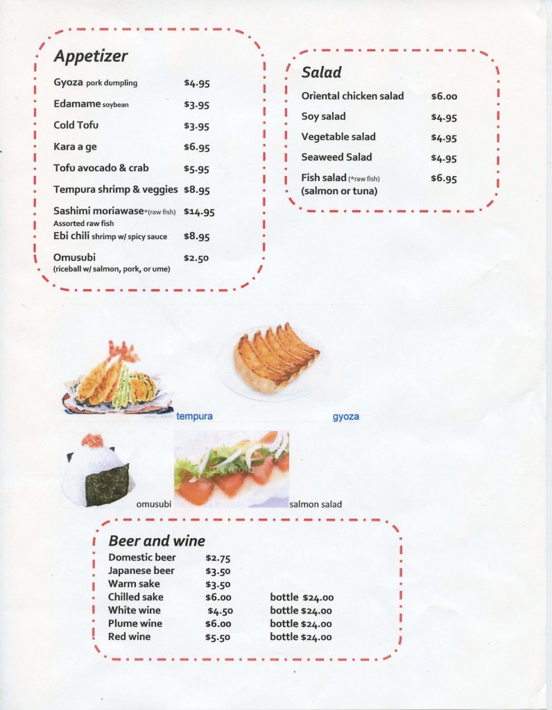
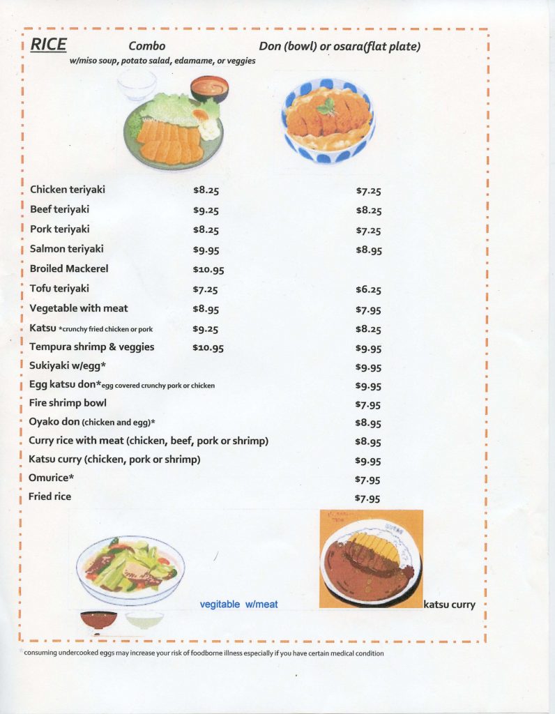
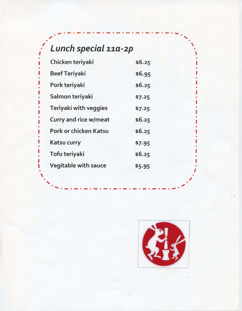
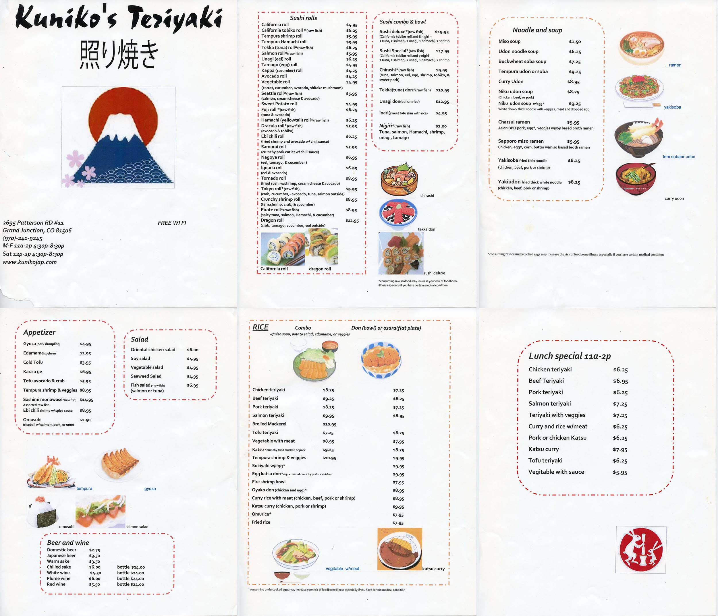
All items and important information from the menu would be kept, but the layout was going to be completely changed. The original menu has 6 pages (including the cover) but could be reduced by clever layout design.
The images were a collection of different photos and illustrations with no cohesive look. I wanted to create a unique style inspired by traditional Japanese inkwork.
First Draft
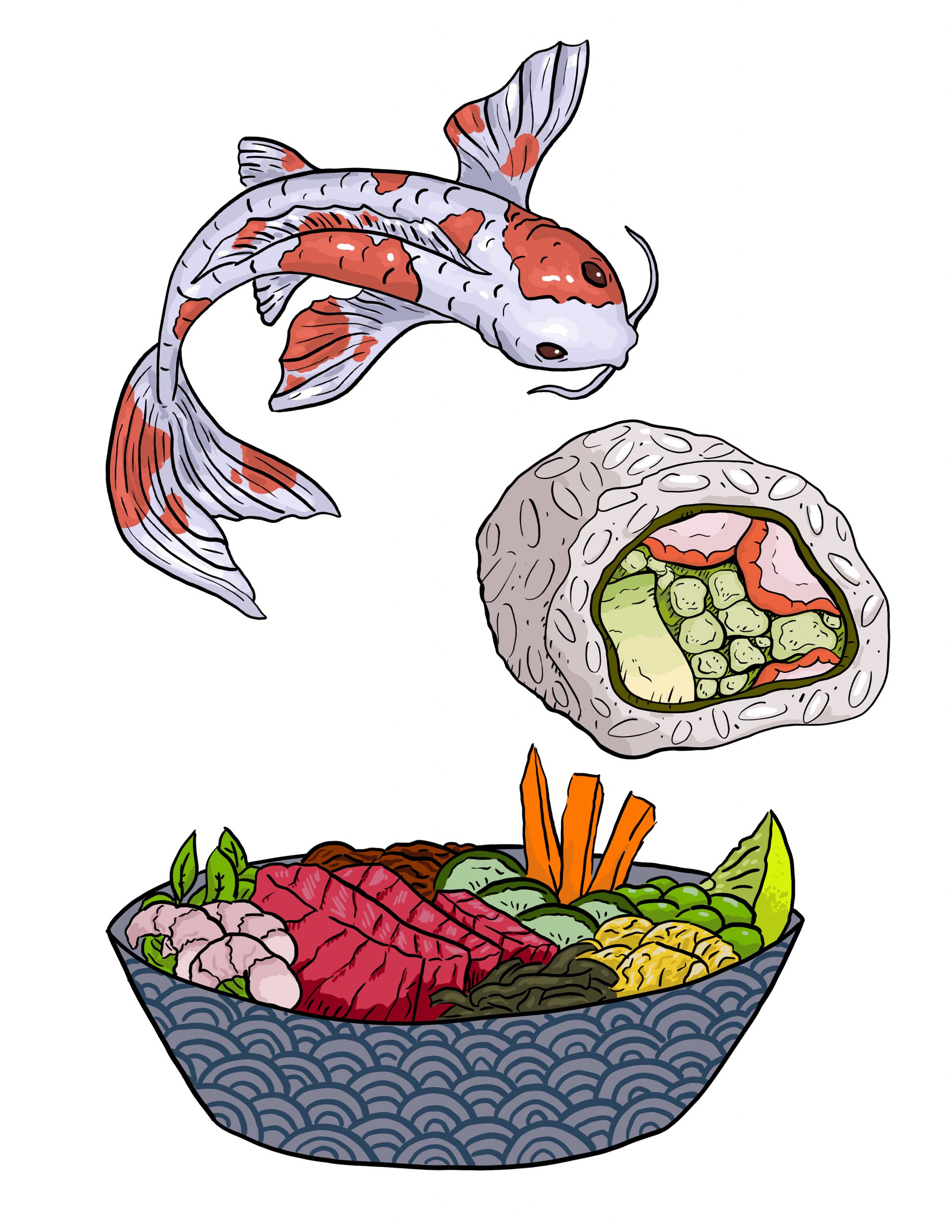
Originally I tried doing the illustrations in Photoshop. While I liked the style, it didn't have the look of Japanese brushwork I was looking for. There were a lot of colors and was very detailed, much unlike japanese ink paintings which were black and white with minimal color.
I wanted something that looked more like a modern illustration done with ink. So, what better way to get there than do it the proper way?
Practicing Brushwork
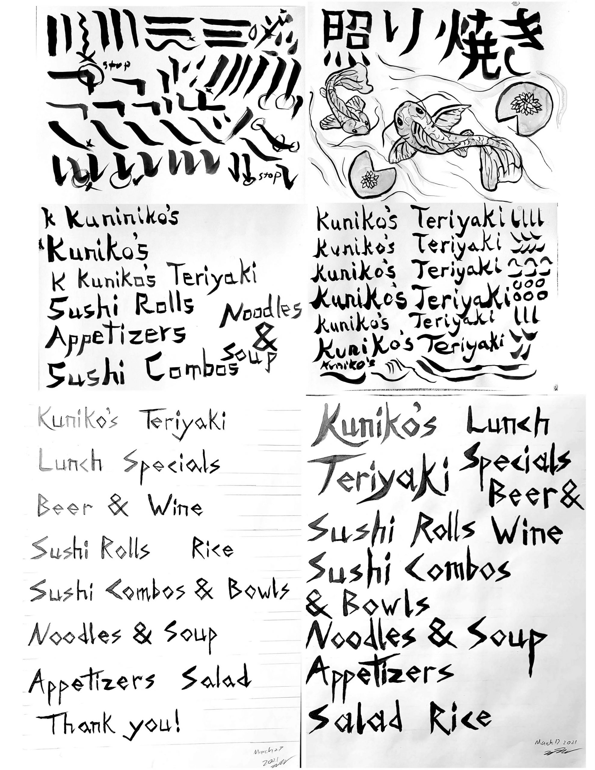
Not satisfied with the digital approach, I got myself a traditional bamboo calligraphy brush and spent some time playing with it.
This was quite challenging. I found a tutorial online, however it was in japanese. My first page I spent following along with the motions and seeing how it was done. I did a page using the characters from the original menu (saying Kuniko's Teriyaki) and gave some koi fish a try. I wanted the different sections of the menu to be titled in this brushwork style, so I wrote everything out several times until I was satisfied with it.
Illustrations
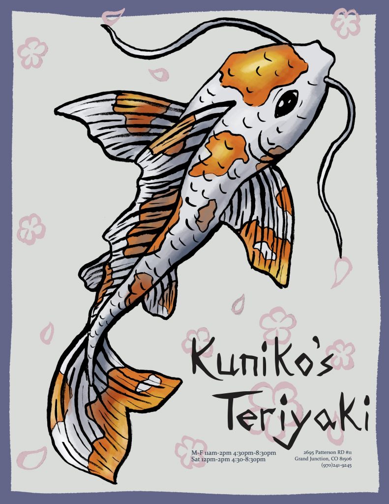
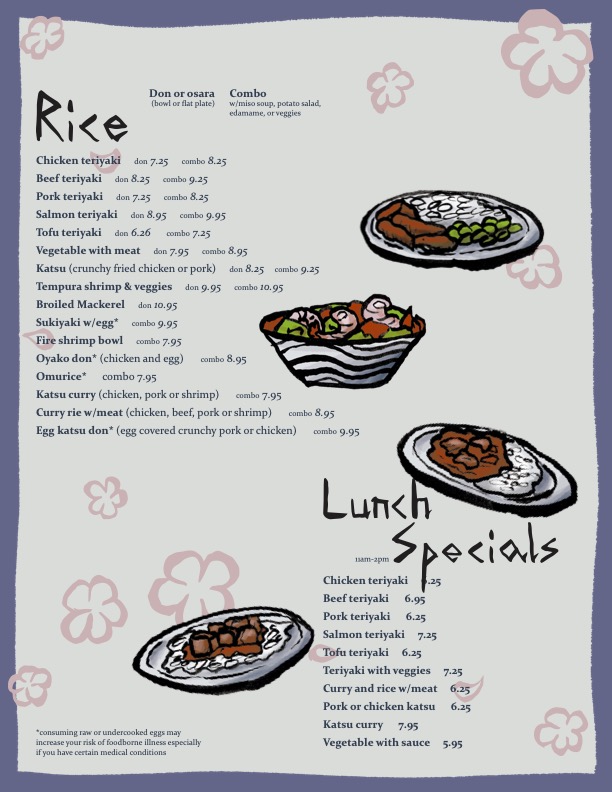
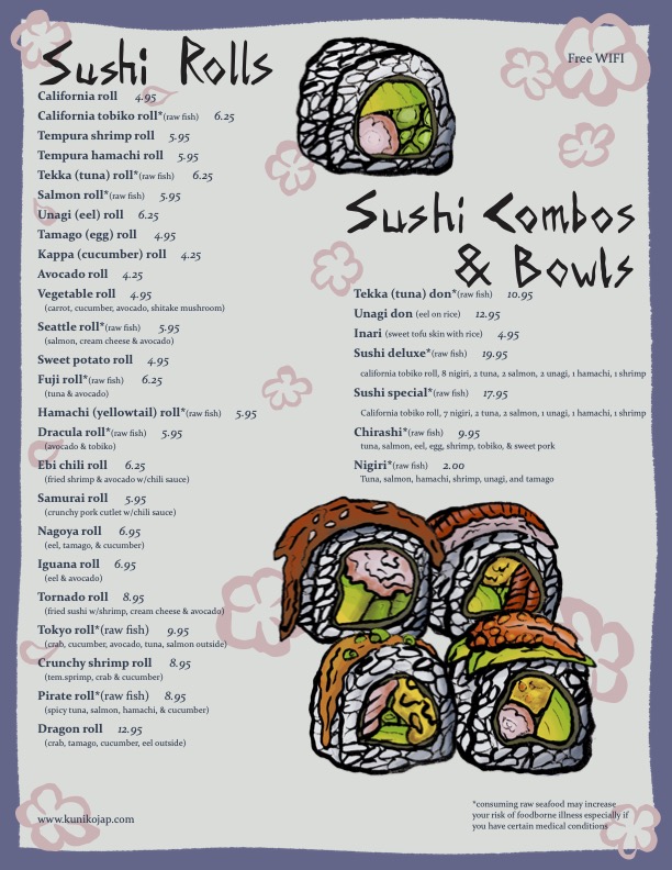
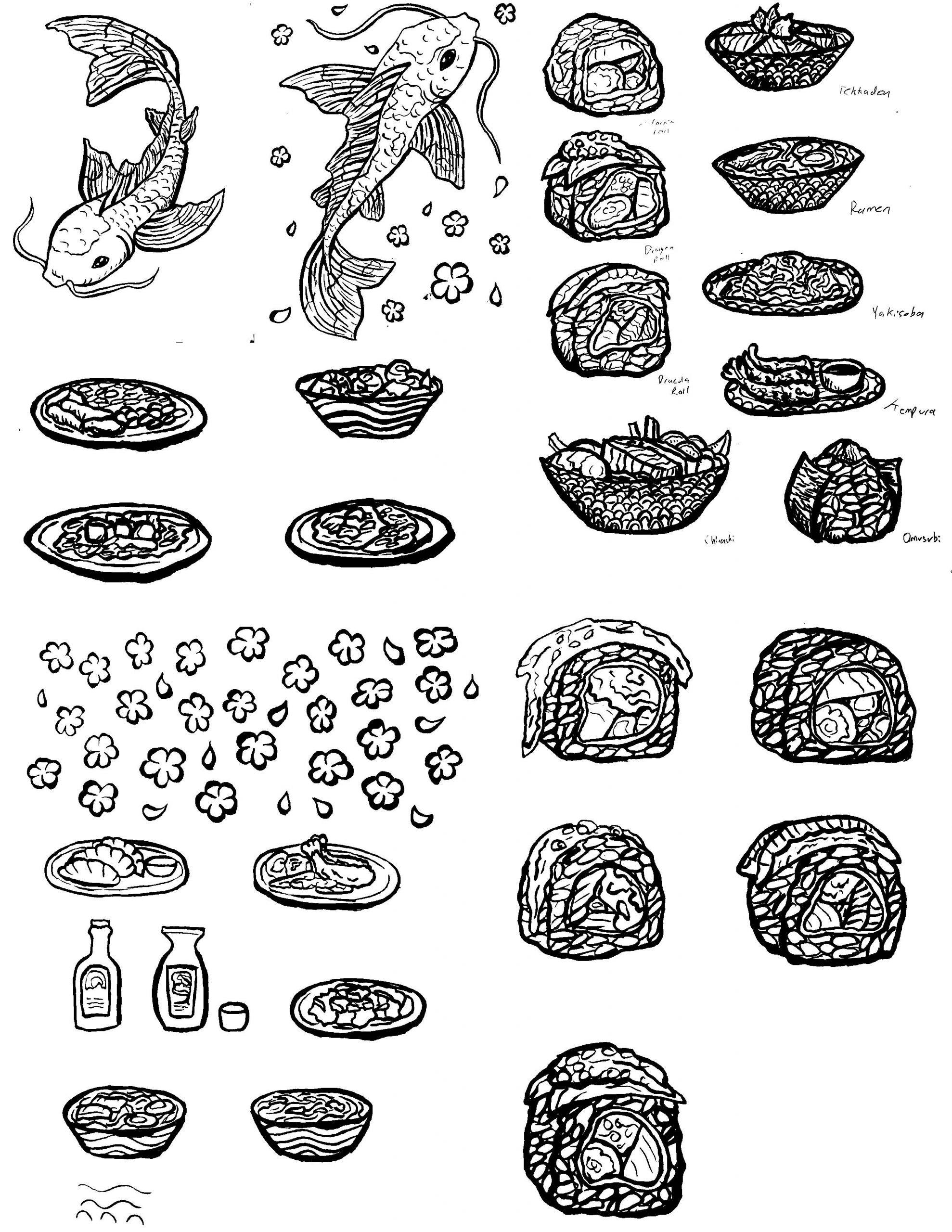
For the illustrations, I chose to do the linework all using the bamboo brushes then scan them into photoshop to add color. I considered getting colored ink, but decided to keep it more consistent by adding it digitally. Plus I was afraid to ruin the nice lineart. I chose a Koi fish for the menu cover and selected a series of items from the menu to add illustrations along side the text. (There are two versions shown here, the first draft and final)
The cherry blossoms I scanned in like the rest of the lineart, but rather than filling them with color, I selected them and filled the lineart itself with the soft pink to use them as accents that wouldn't be too bold.
Full First Draft
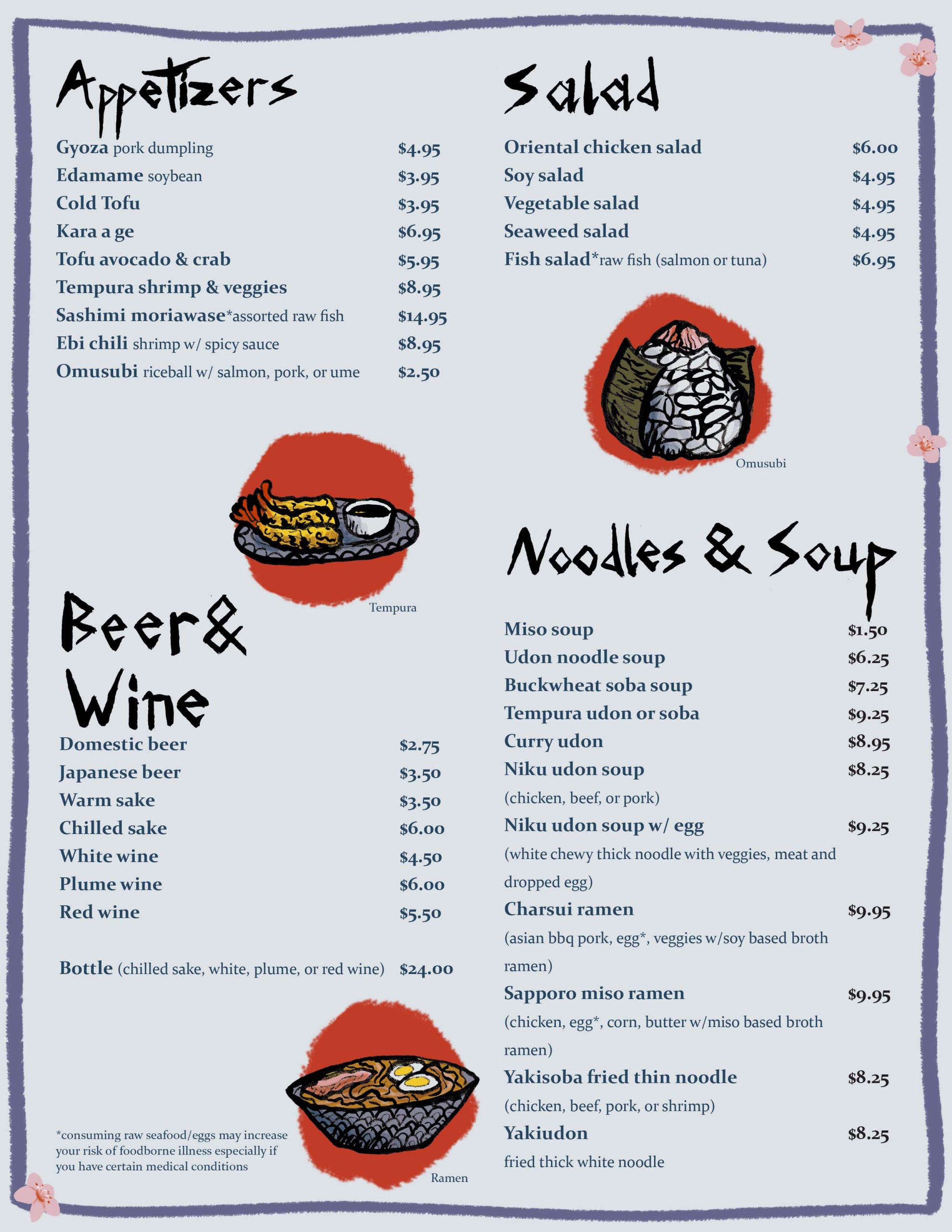
In the first draft, I tried to include the red Japan sun behind the illustrations. This ended up far too distracting. This first run of menu labels was also a bit too sloppy and needed more work to feel cohesive. The order of items was making sense, but the prices were too far away from the items themselves, making it difficult to determine what price belonged to an item. In this first draft I added the flowers using digital brushwork and they felt disconnected from the rest of the visuals.
So for the final menu I needed to adjust the illustrations, lettering, and most importantly, the hierarchy in layout.
Final Draft
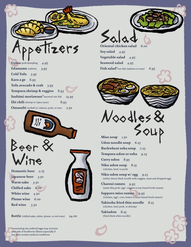
For the final menu, prices were set beside the name of the item to avoid confusion. Illustrations no longer have the distracting, bright red. Now the cherry blossoms matched the line art of the illustrations while fading into the background with the soft pink color. Titles are much more consistent and easy to read. Colors for the background were tweaked a tiny bit to ensure readability. Rather than having the name of the items featured, flower petals sit beside the items shown in illustrations to give a subtle cue.
Overall I am very happy with this menu design. It is easy to follow along and the visuals are very pleasing to look at.
Before
After
Redesigning a Menu
Taking an old menu design and creating an idea for a new look.
All items and important information from the menu would be kept, but the layout was going to be completely changed. The original menu has 6 pages (including the cover) but could be reduced by clever layout design.
The images were a collection of different photos and illustrations with no cohesive look. I wanted to create a unique style inspired by traditional Japanese inkwork.

First Draft
Originally I tried doing the illustrations in Photoshop. While I liked the style, it didn't have the look of Japanese brushwork I was looking for. There were a lot of colors and was very detailed, much unlike japanese ink paintings which were black and white with minimal color.
I wanted something that looked more like a modern illustration done with ink. So, what better way to get there than do it the proper way?

Practicing Brushwork
Not satisfied with the digital approach, I got myself a traditional bamboo calligraphy brush and spent some time playing with it.
This was quite challenging. I found a tutorial online, however it was in japanese. My first page I spent following along with the motions and seeing how it was done. I did a page using the characters from the original menu (saying Kuniko's Teriyaki) and gave some koi fish a try. I wanted the different sections of the menu to be titled in this brushwork style, so I wrote everything out several times until I was satisfied with it.

Practicing Brushwork
For the illustrations, I chose to do the linework all using the bamboo brushes then scan them into photoshop to add color. I considered getting colored ink, but decided to keep it more consistent by adding it digitally. Plus I was afraid to ruin the nice lineart. I chose a Koi fish for the menu cover and selected a series of items from the menu to add illustrations along side the text. (There are two versions shown here, the first draft and final)
The cherry blossoms I scanned in like the rest of the lineart, but rather than filling them with color, I selected them and filled the lineart itself with the soft pink to use them as accents that wouldn't be too bold.

Full First Draft
In the first draft, I tried to include the red Japan sun behind the illustrations. This ended up far too distracting. This first run of menu labels was also a bit too sloppy and needed more work to feel cohesive. The order of items was making sense, but the prices were too far away from the items themselves, making it difficult to determine what price belonged to an item. In this first draft I added the flowers using digital brushwork and they felt disconnected from the rest of the visuals.
So for the final menu I needed to adjust the illustrations, lettering, and most importantly, the hierarchy in layout.

Final Draft
For the final menu, prices were set beside the name of the item to avoid confusion. Illustrations no longer have the distracting, bright red. Now the cherry blossoms matched the line art of the illustrations while fading into the background with the soft pink color. Titles are much more consistent and easy to read. Colors for the background were tweaked a tiny bit to ensure readability. Rather than having the name of the items featured, flower petals sit beside the items shown in illustrations to give a subtle cue.
Overall I am very happy with this menu design. It is easy to follow along and the visuals are very pleasing to look at.
