Planning
I was tasked with creating a fictitious cosmetics brand and product centered around a round metal tin. I decided to go with a hand salve designed with those who work at a desk all day in mind. I chose the name Carpe Manus meaning literally "seize the hands" (inspired by the saying carpe diem, "seize the day").
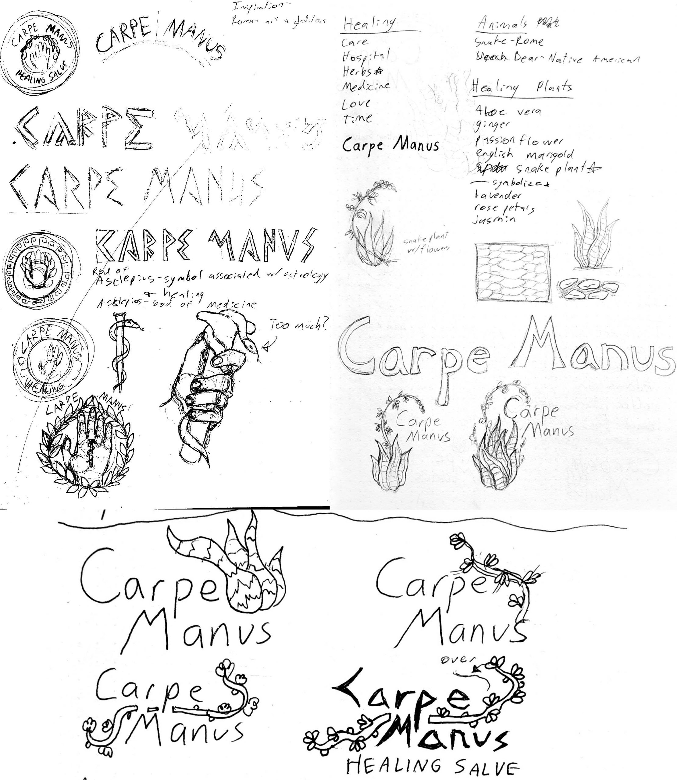
For the logo I wanted to use a script typeface with some kind of icon. I wanted it to reflect healing and did a bit of brainstorming. Since the name was latin, I thought of taking inspiration from the romans in some way. Originally I thought of a snake from the caduceus as it is one of the common symbols for healthcare. However, I much preferred the idea of a plant. I found that the snake plant is considered by some to be a symbol of good luck, purity, and positivity. Going off this, I sketched some ideas including a snake plant in bloom to reflect revitalization. In the end, I chose to use the snake plant flower for the icon.
Patterns
Now I could move on to the package design. I would need stickers for the top and bottom of the tin, a thin sticker for around the side of the tin, and a box to hold the tin in. The company would have different scents of hand salve to cater to their audience. I wanted to try to keep the packaging fairly gender neutral, but with floral style patterns it could be considered "feminine".
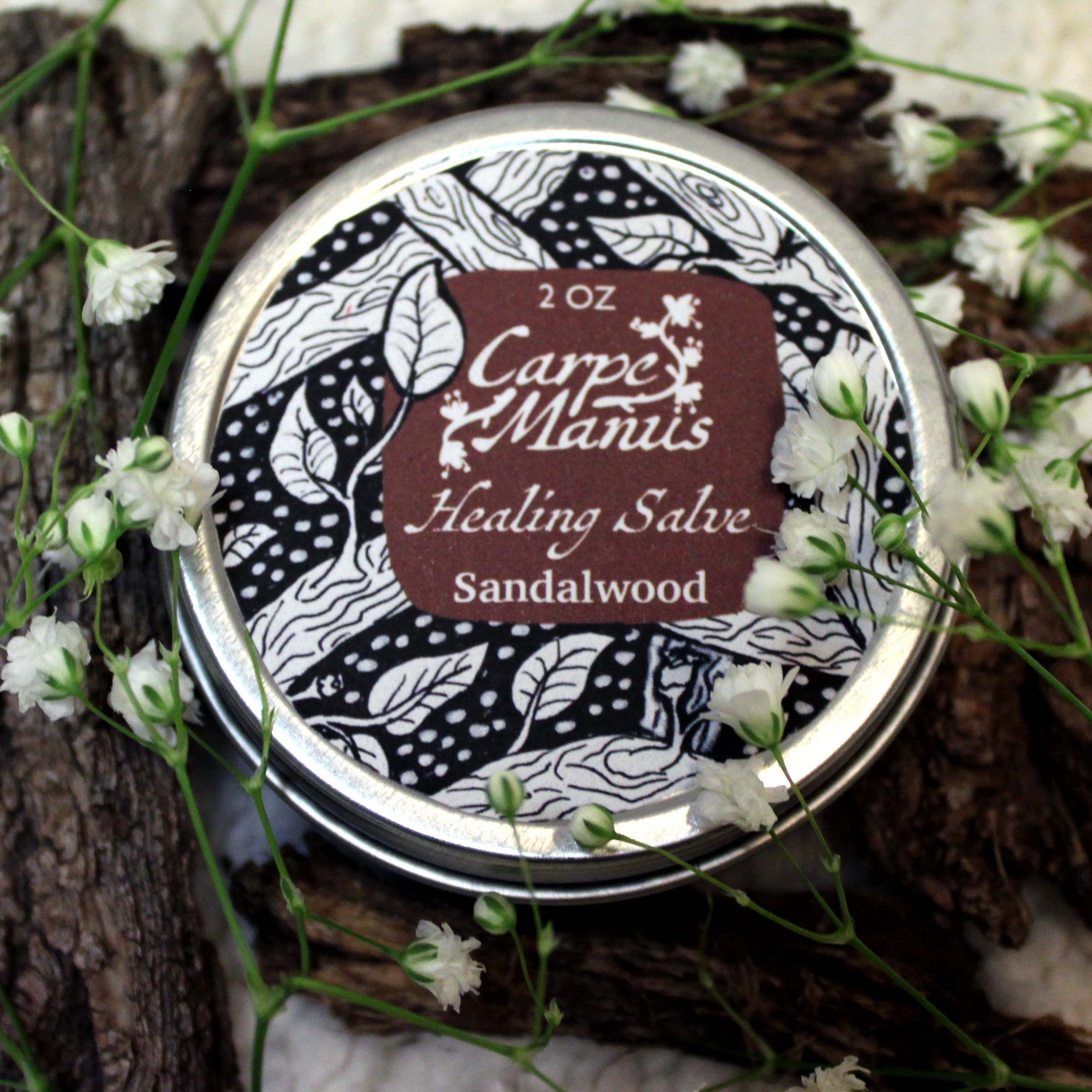
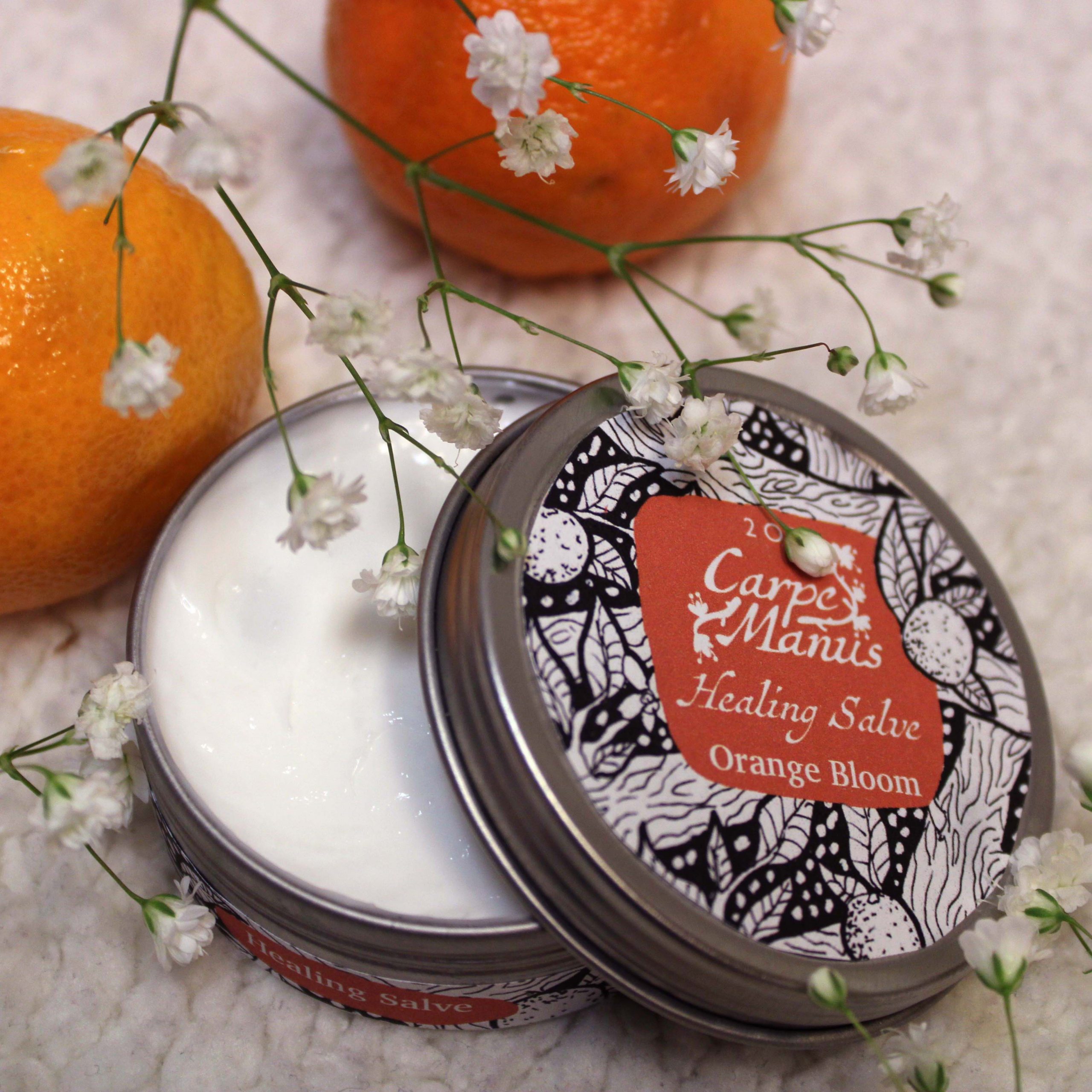
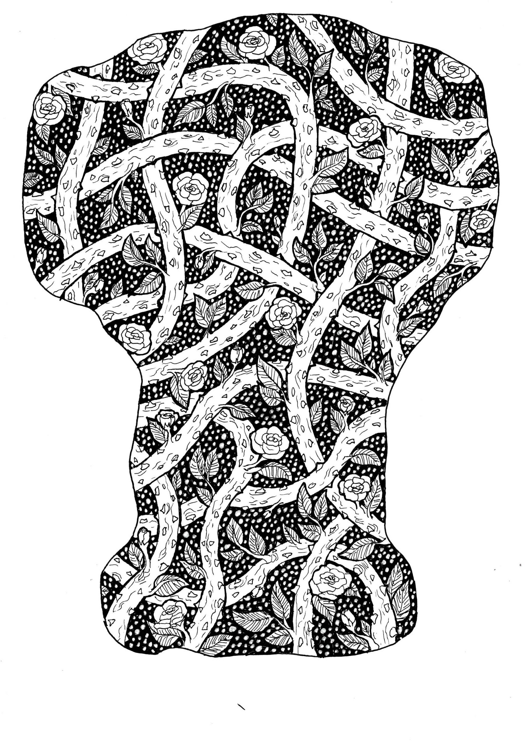
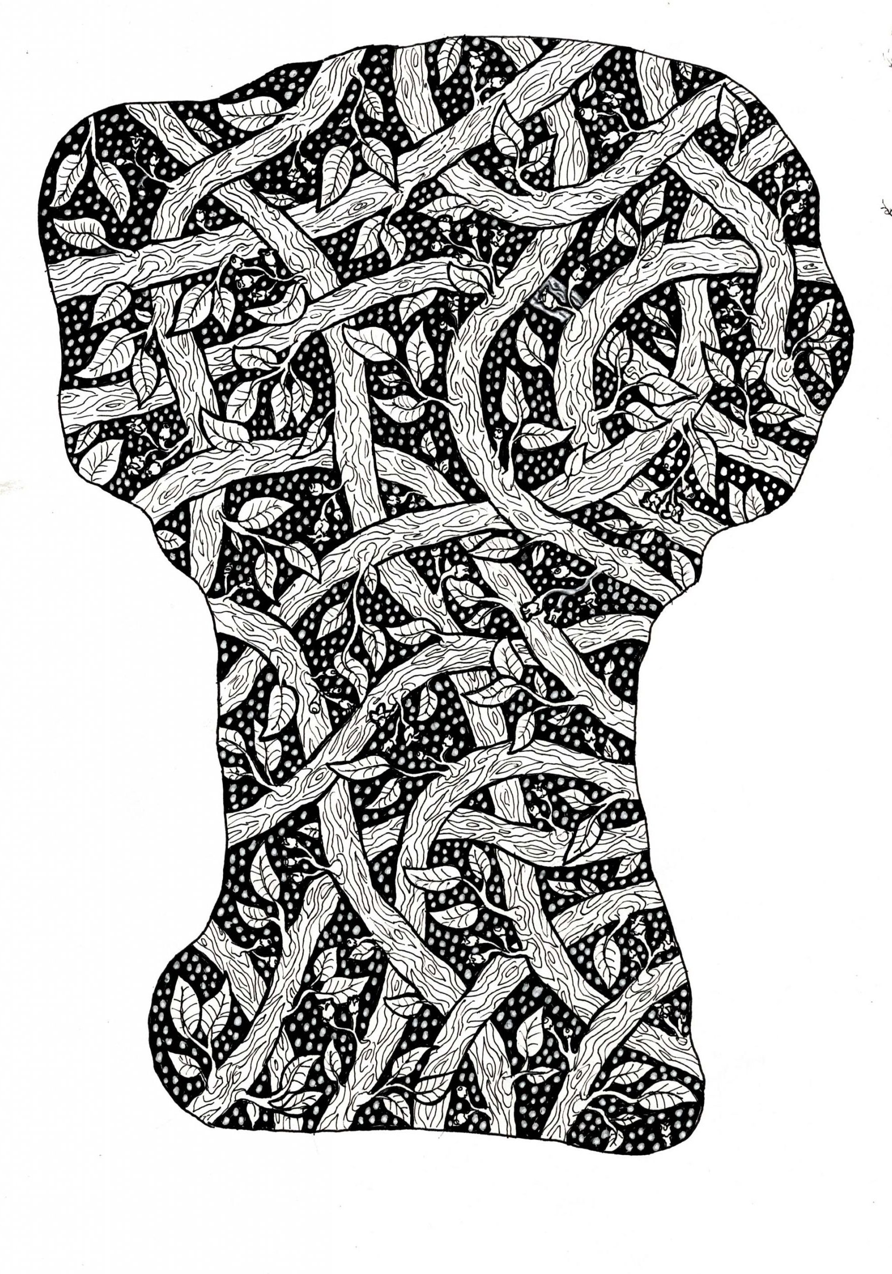
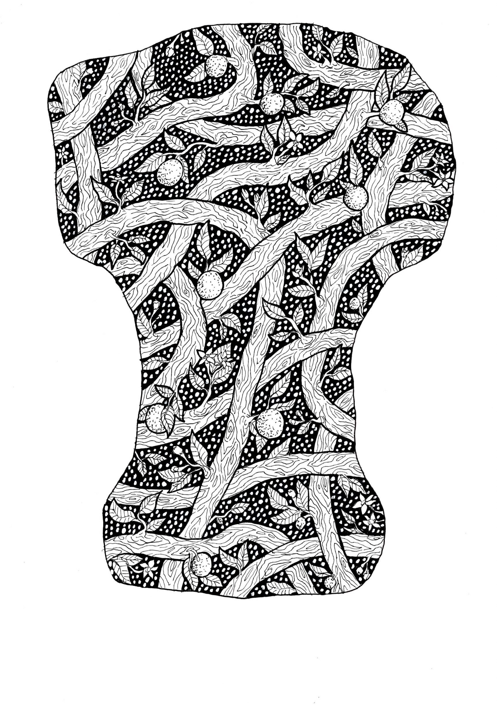
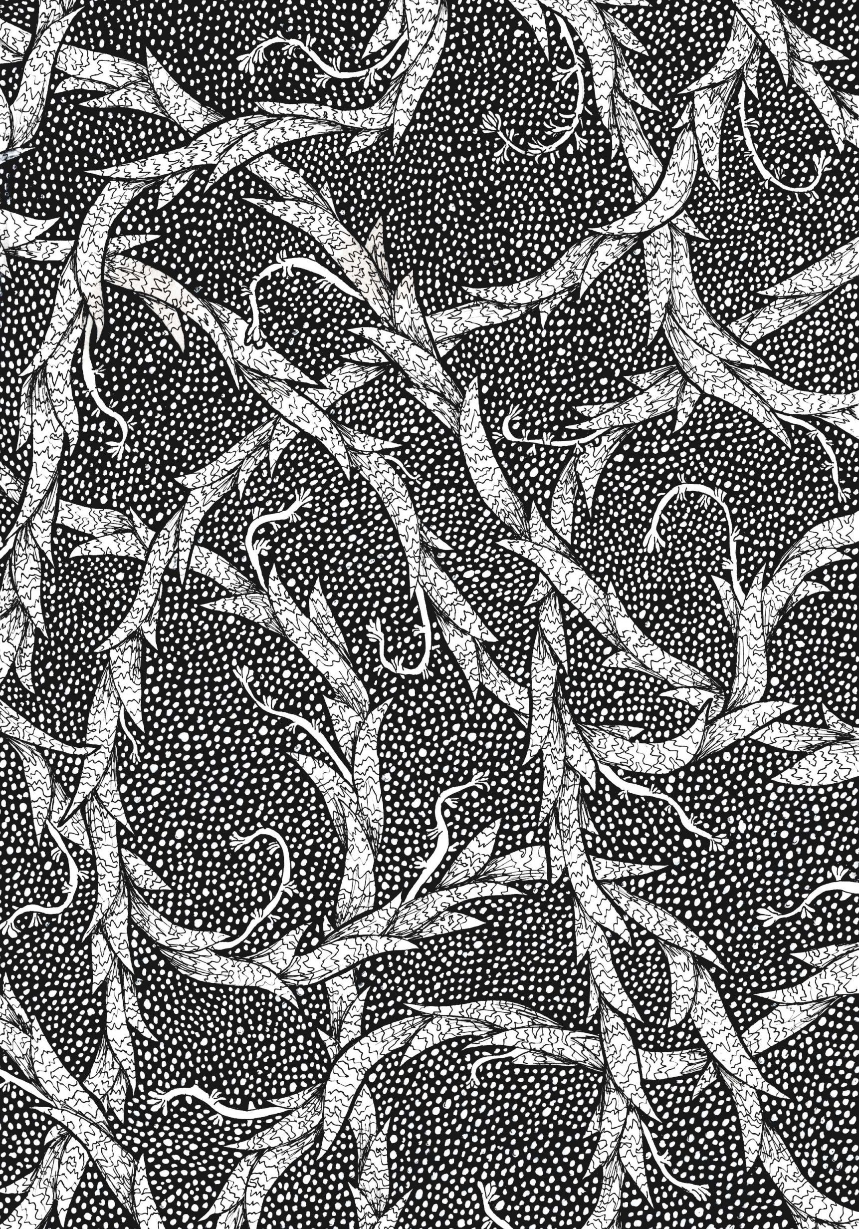
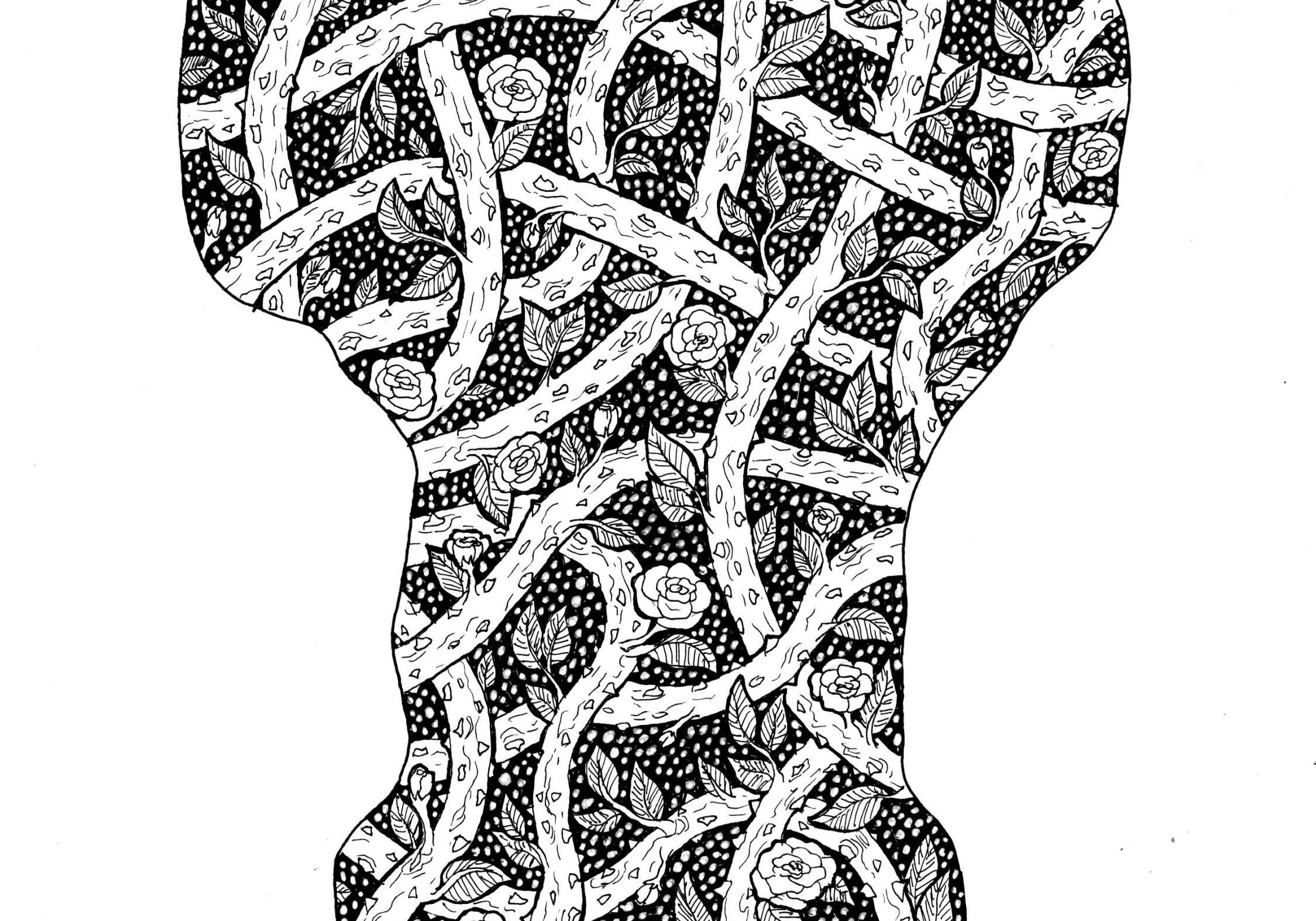
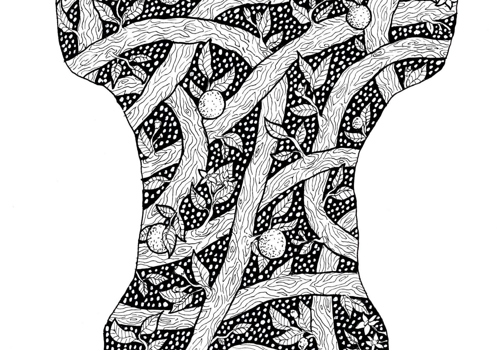
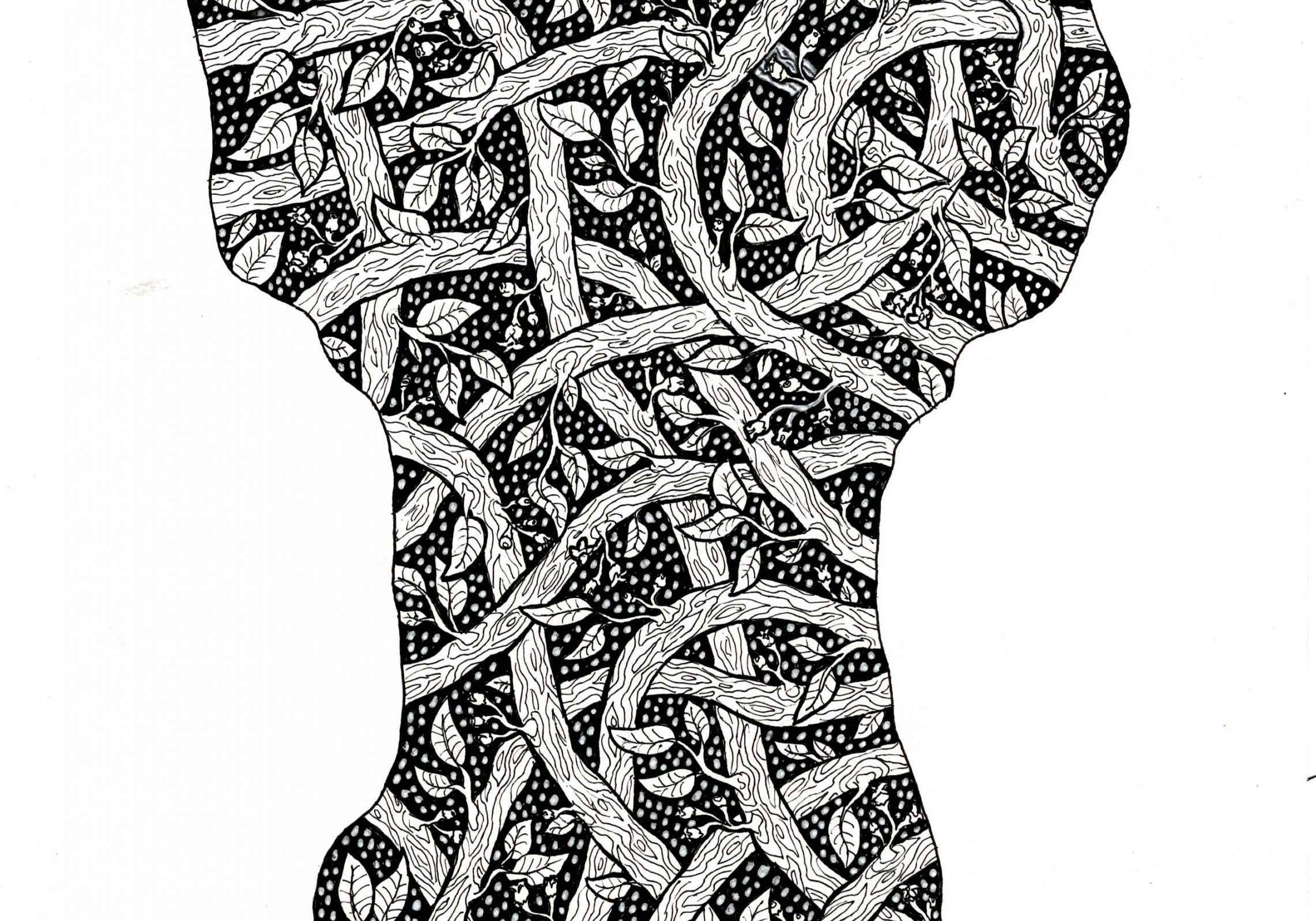
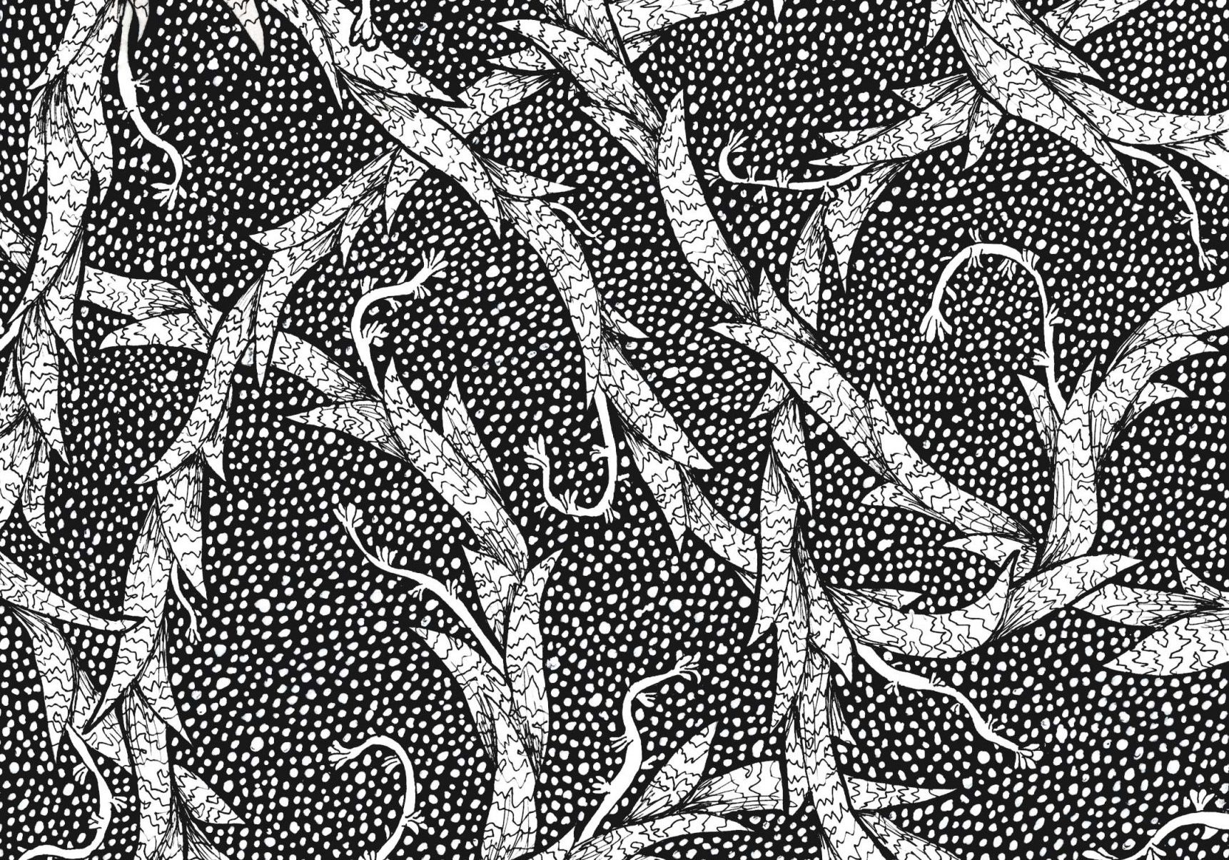
I chose three scents; rose (often considered feminine), sandalwood (often considered more masculine), and orange bloom (could be more gender neutral). I created a pattern for each the right size to be made into the box and taken apart for other aspects of the designs. I also created a full page pattern using snake plants that could be used to auxiliary products to promote the brand.
Assets
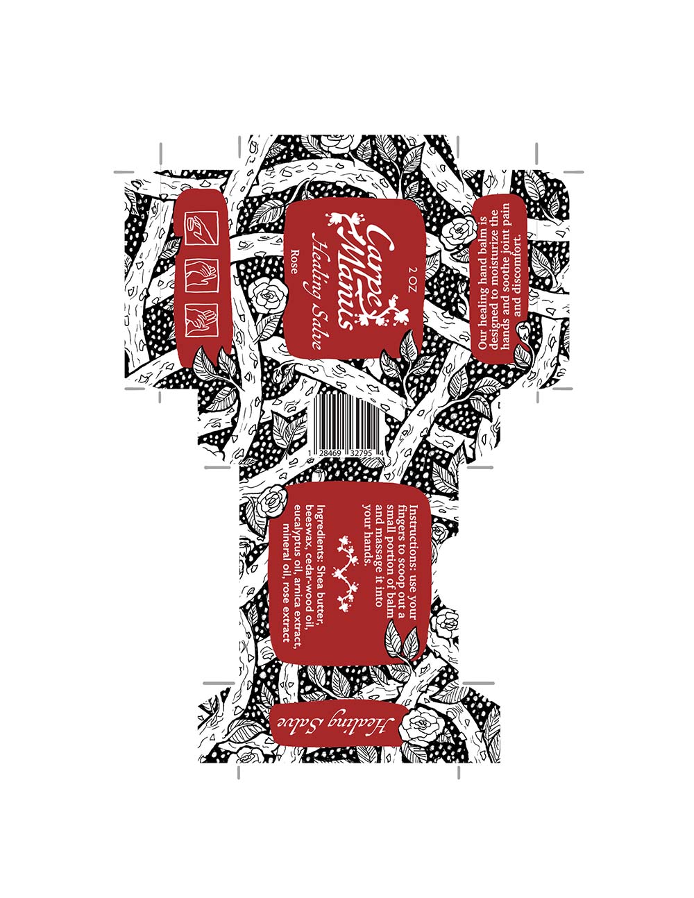
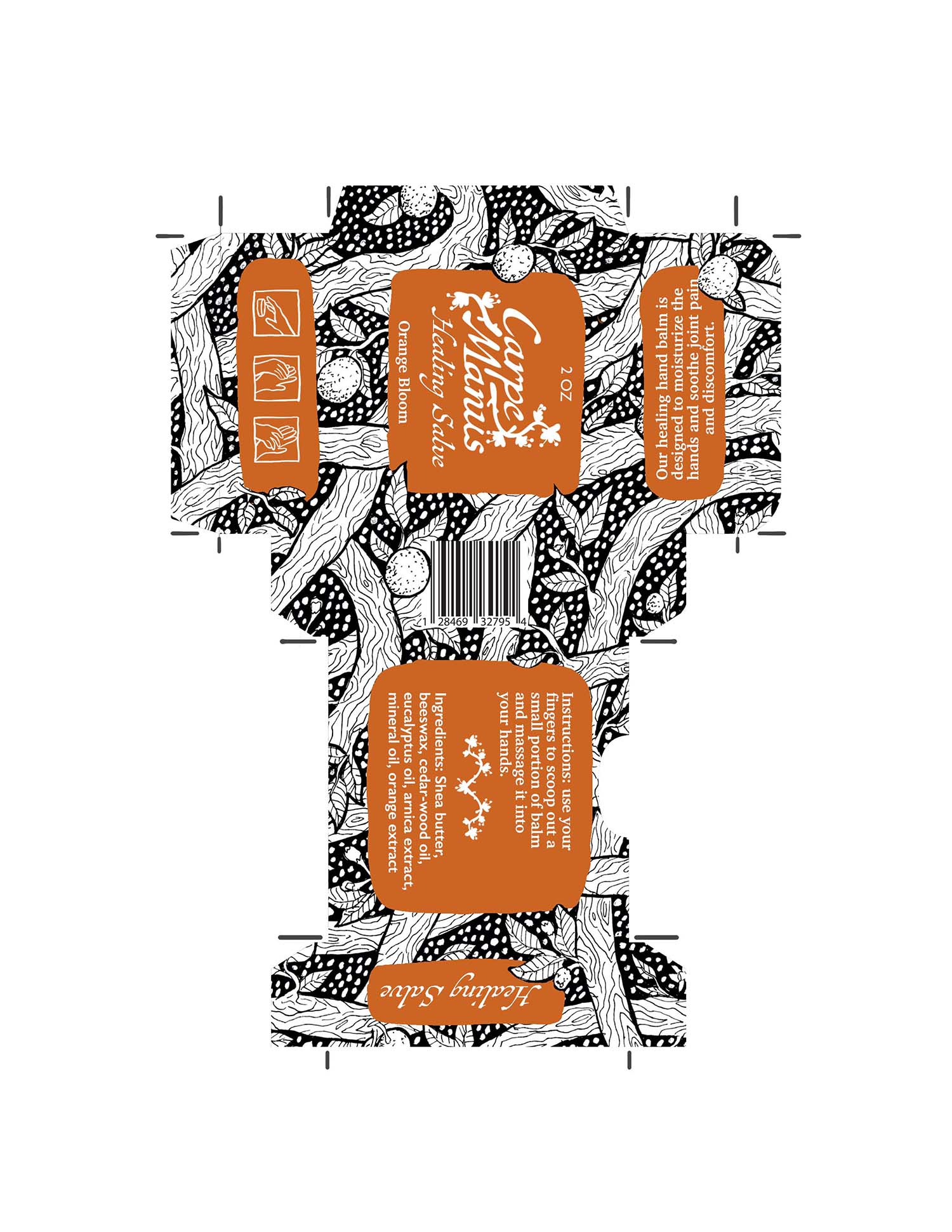
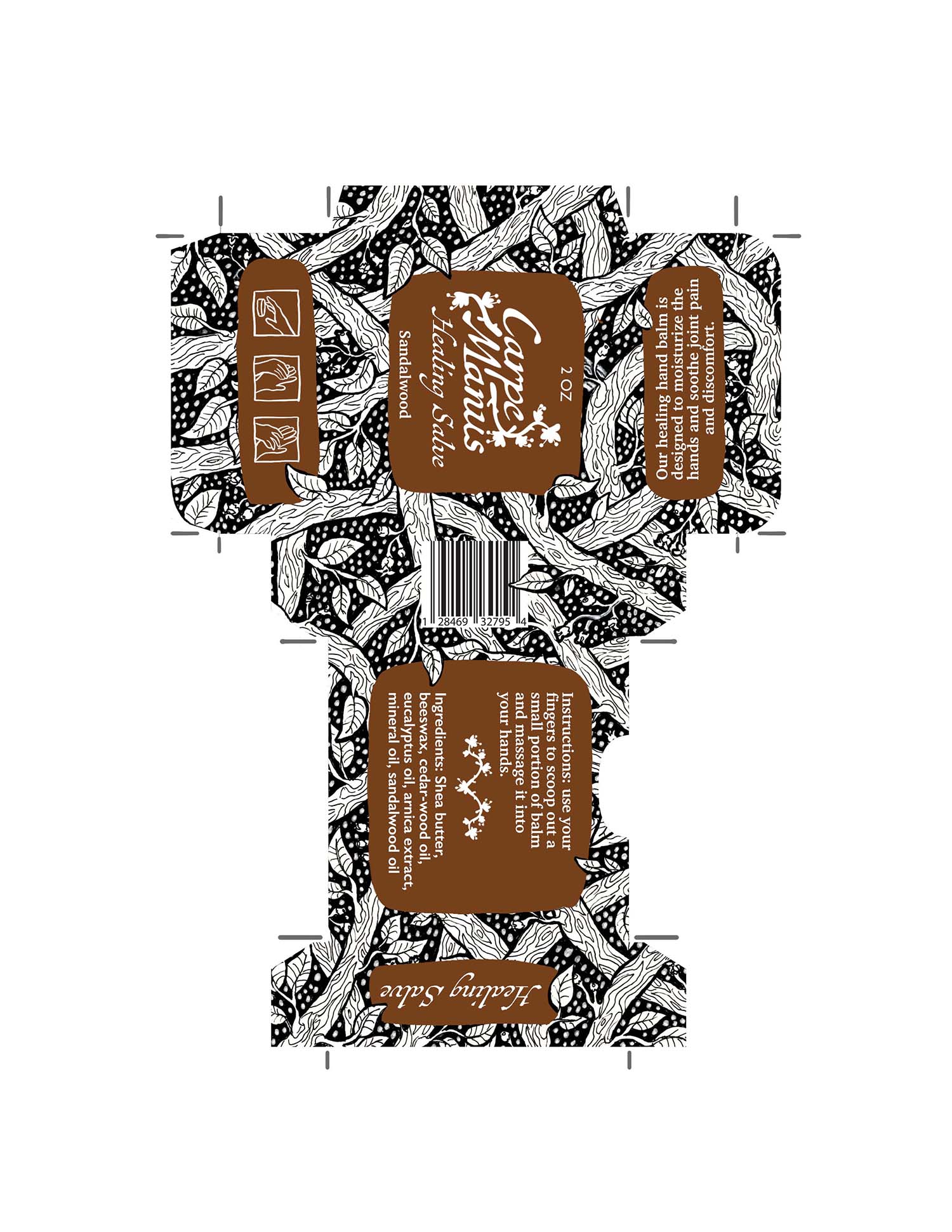
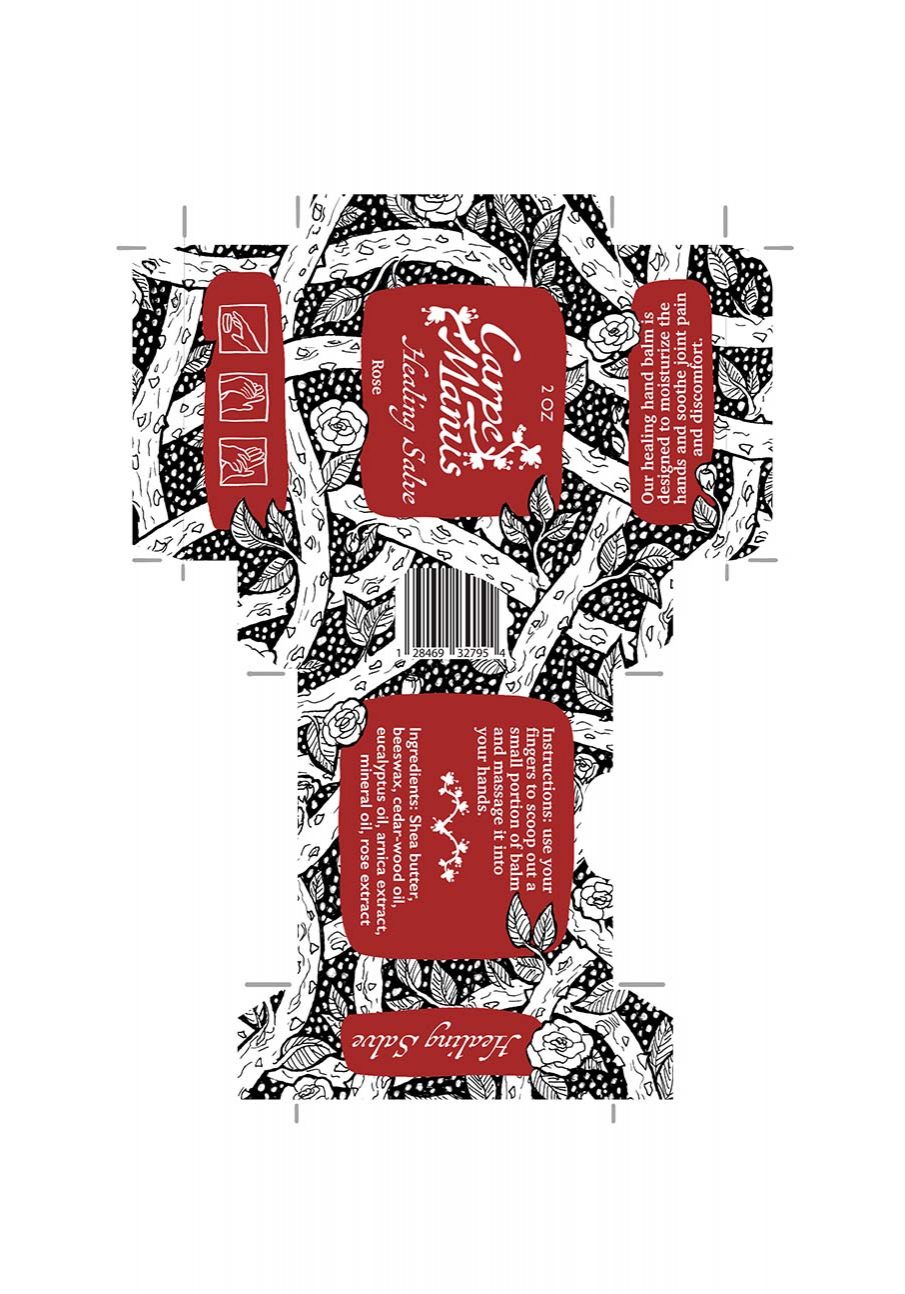
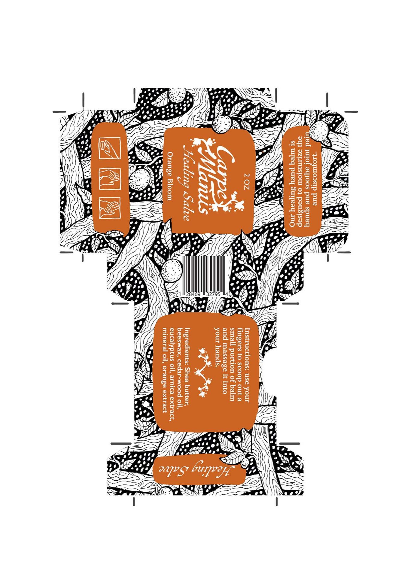
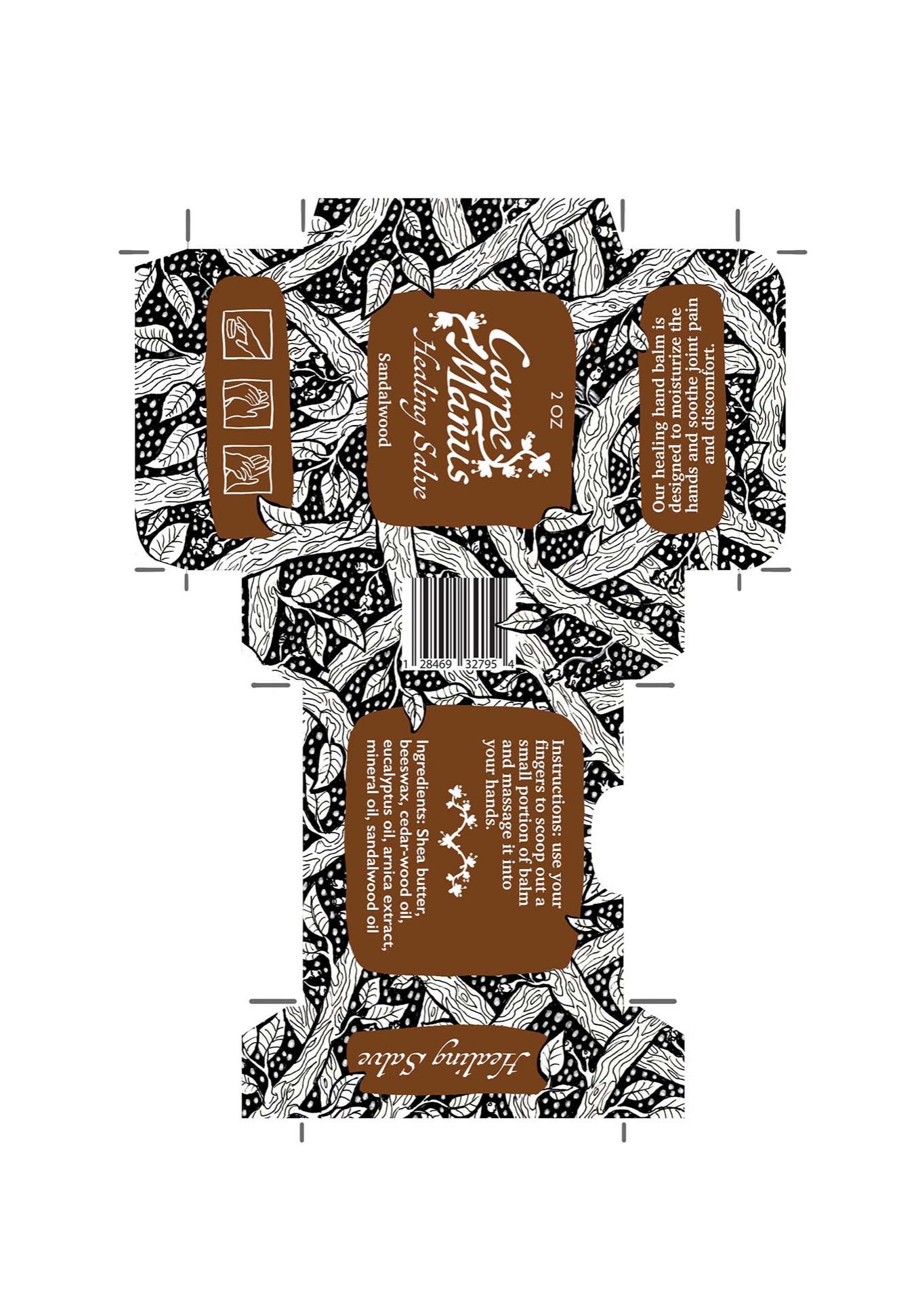
With the textures made, I created a box template using a basic top opening box template online for inspiration and creating a paper one using the tin to ensure a perfect fit. Template made, I added the texture and created the layout for all information. To keep them consistent but still highlight the difference in scents, each is black and white with only a single color.
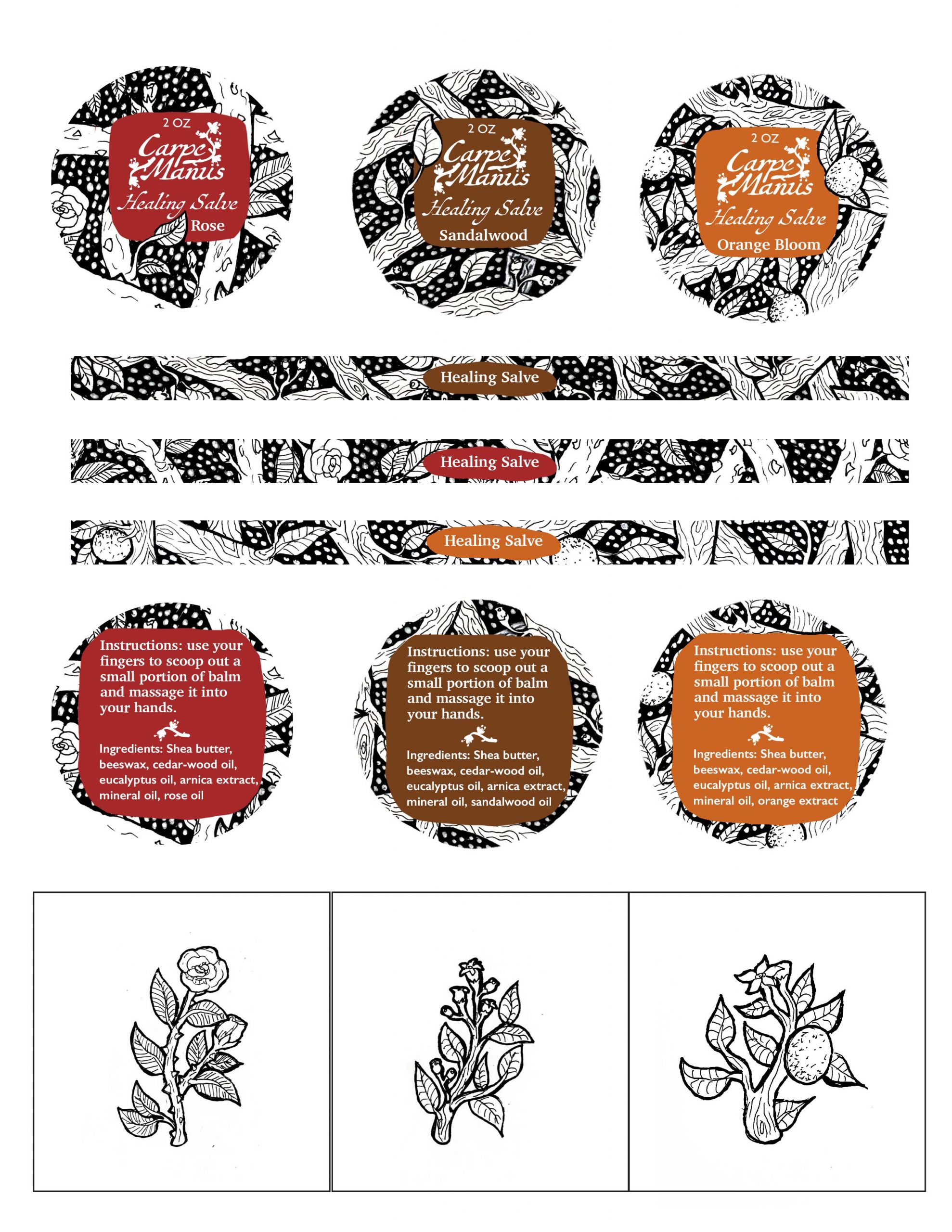
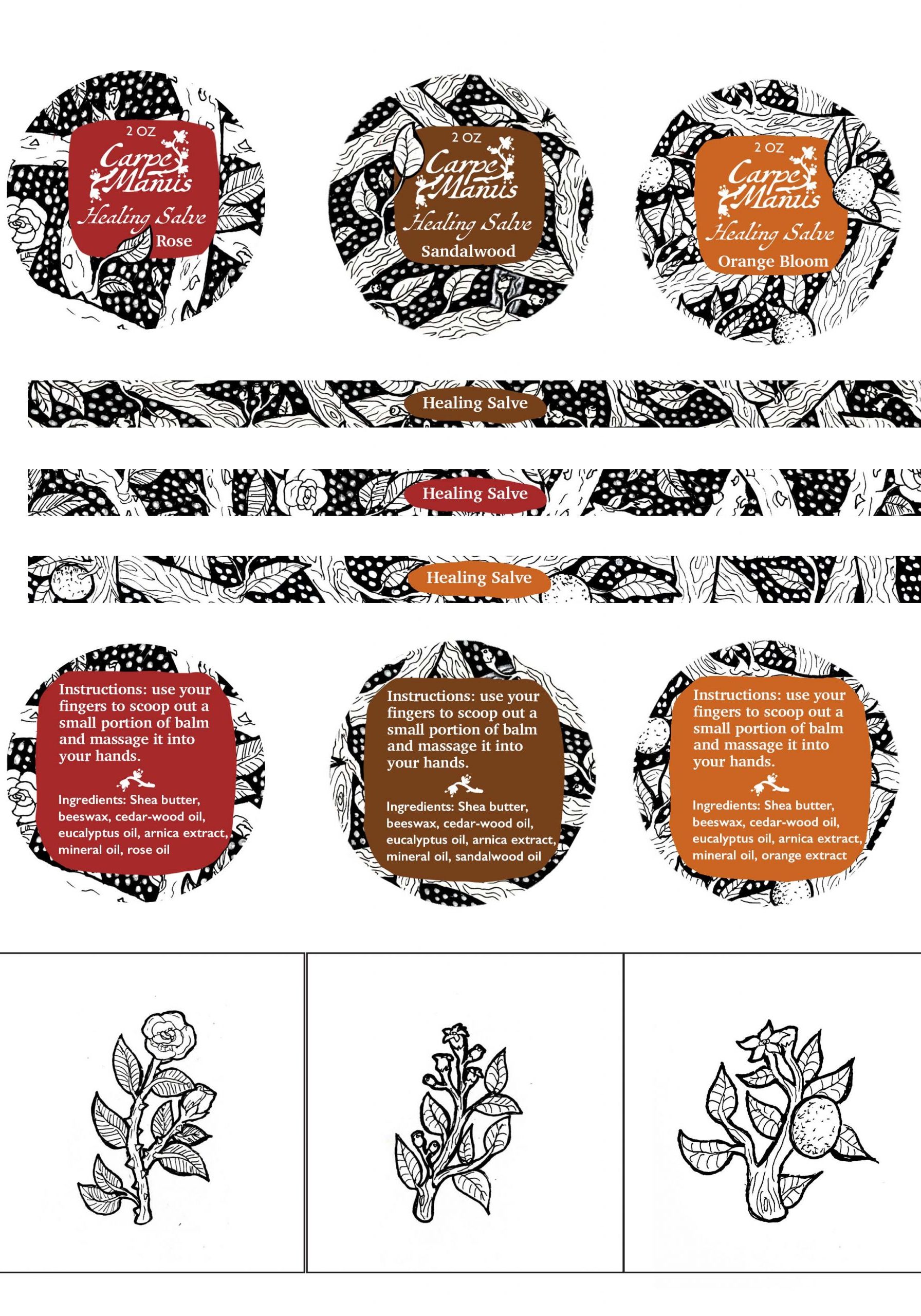
I used the same pattern to help create the background for the stickers. The label matches the box with all information carried through in case the consumer discards the box.



Assembly
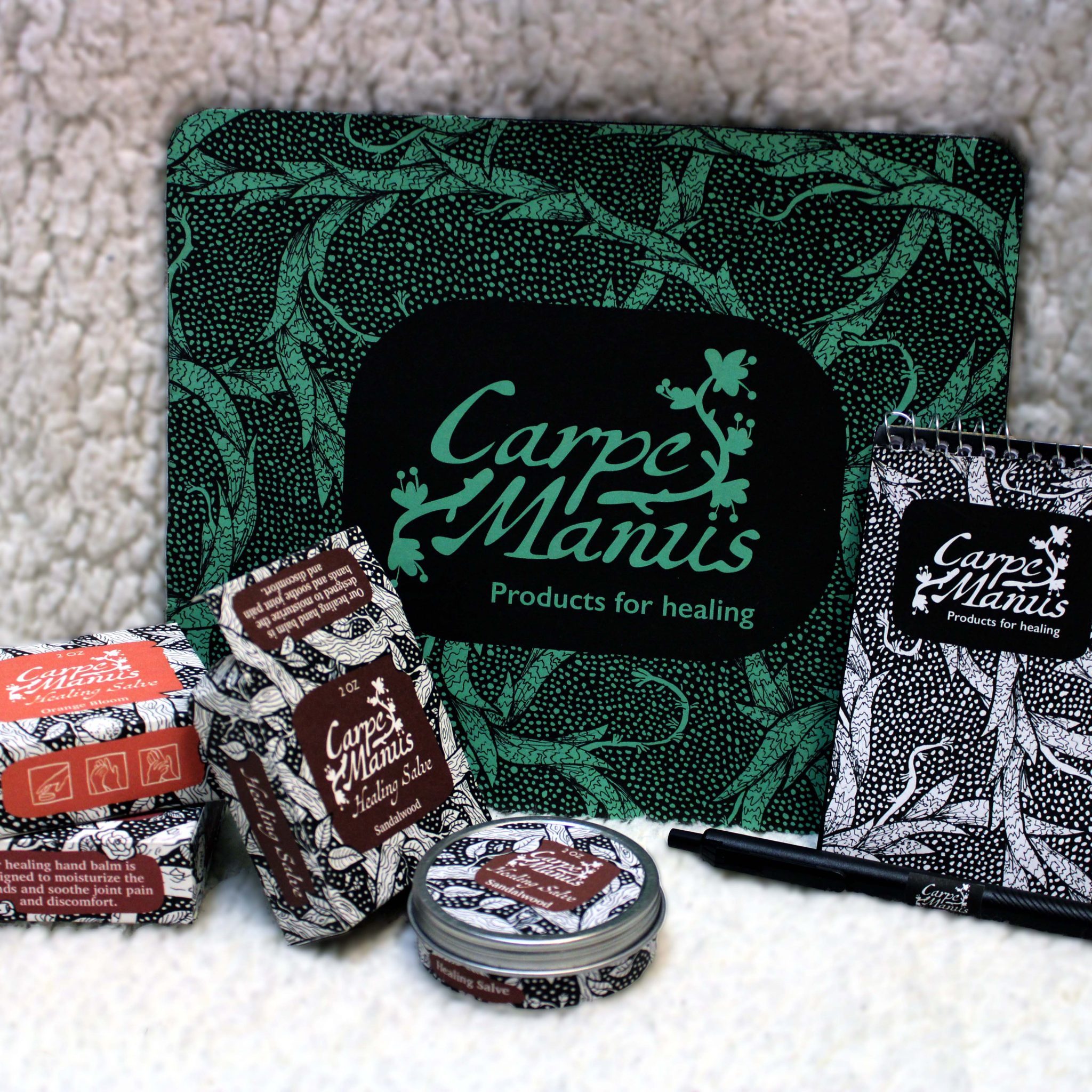
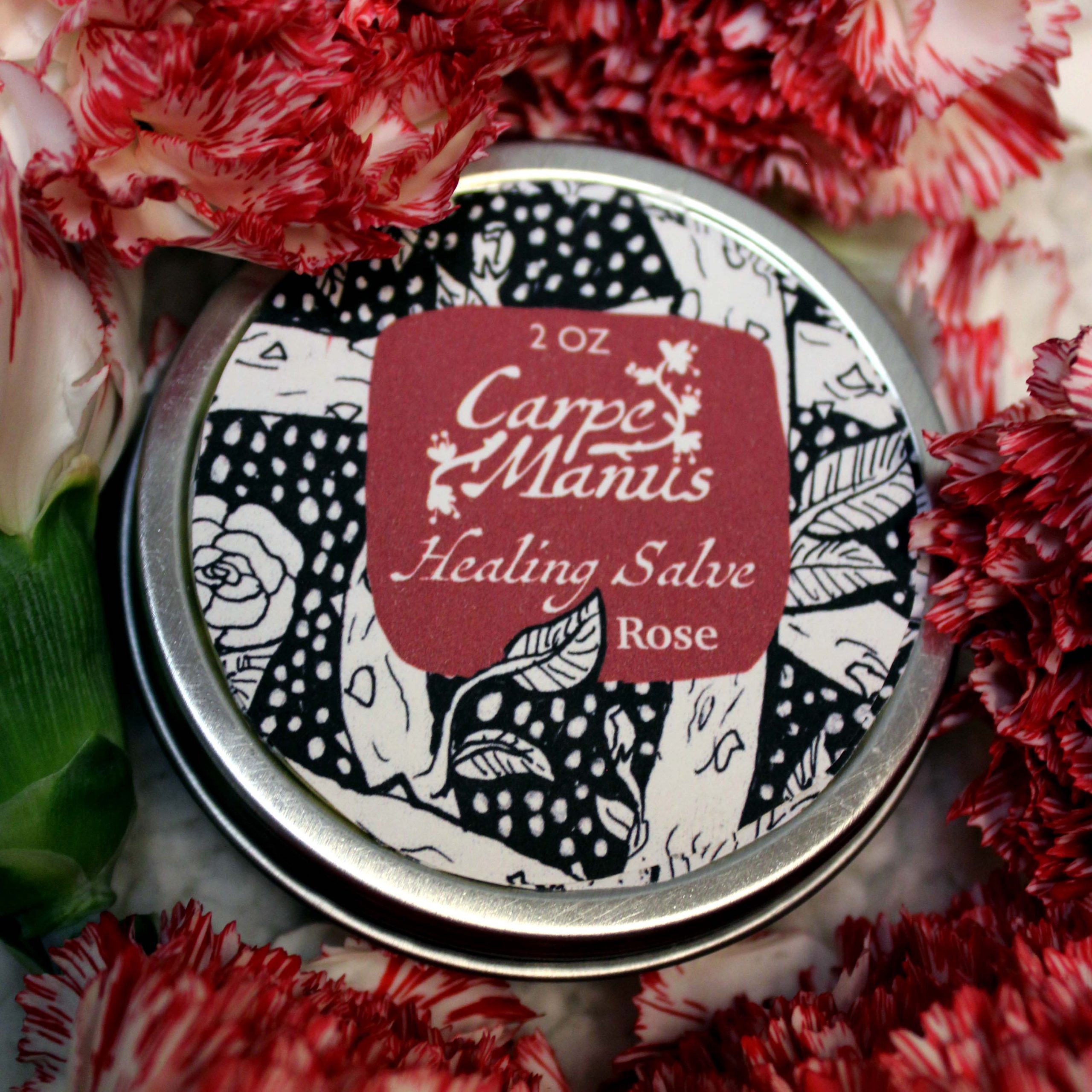
Templates made, I was able to print and assemble everything. The boxes were printed on strong cardstock on my home printer. The cardstock is strong enough to hold shape well and hold the tin. Stickers were also printed on the same printer onto plain sticker paper. Everything was cut out by hand and assembled.
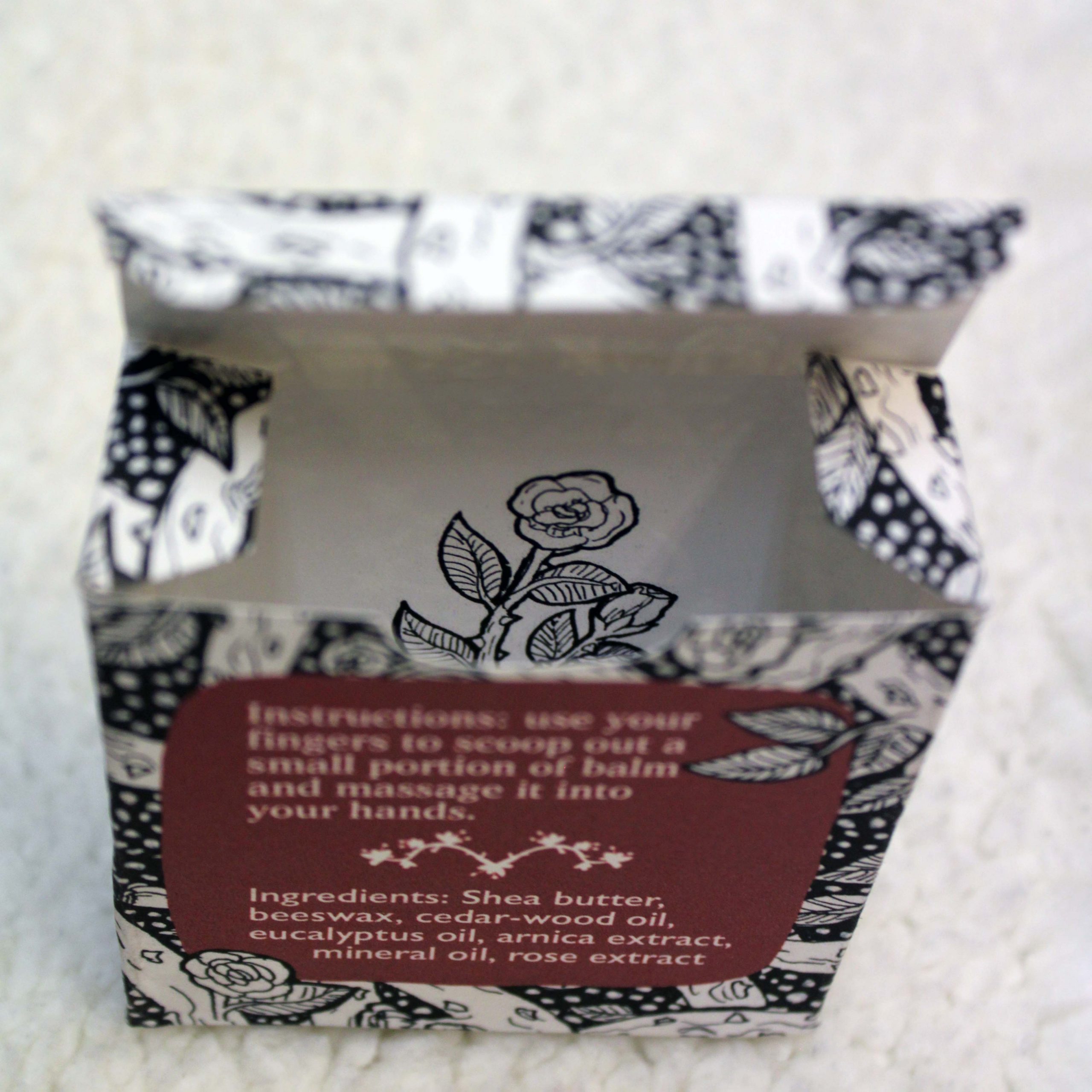
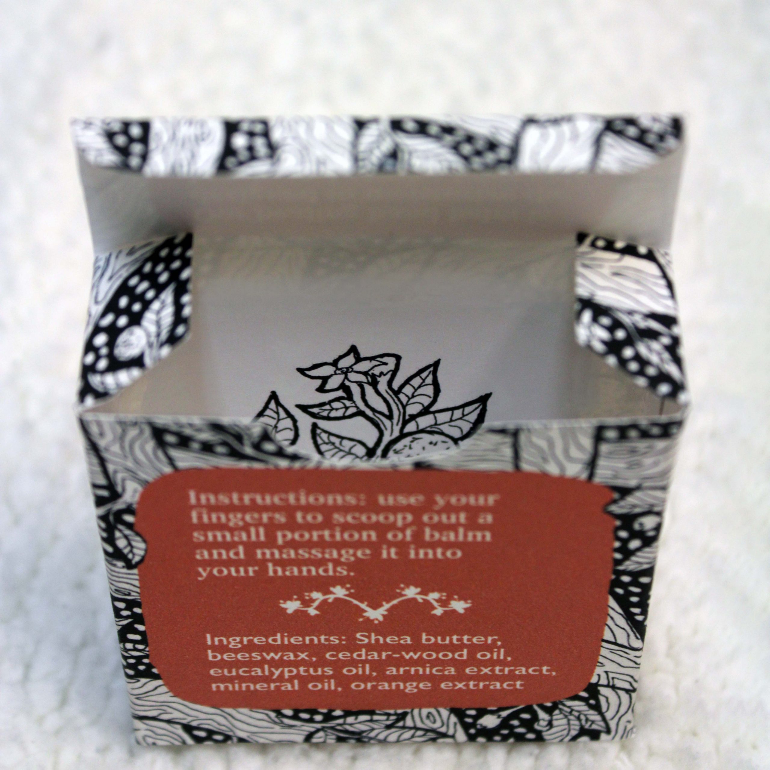
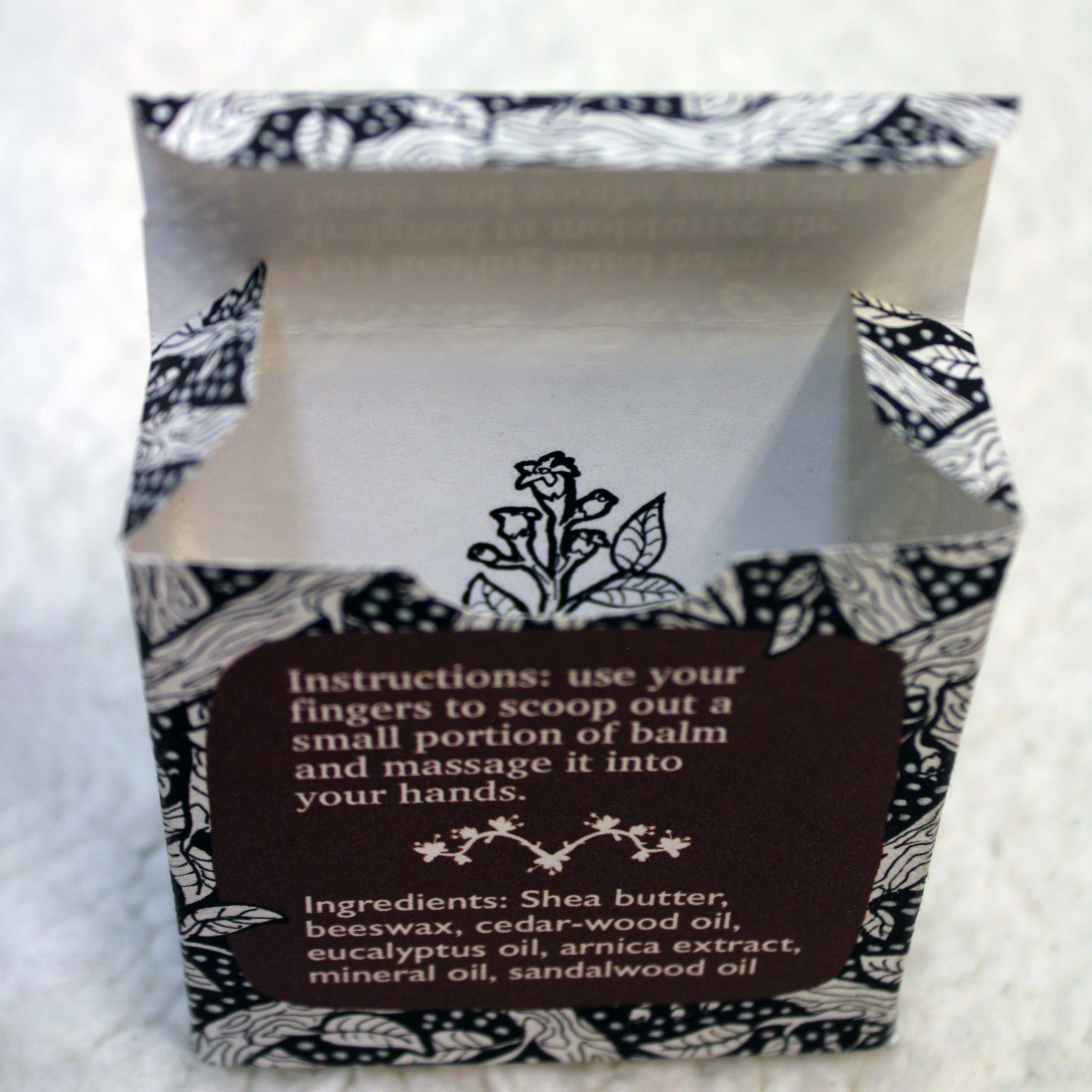
As an added detail, I created a small illustration of each scent cue and printed it to be placed inside of the box.
To mock up promotional items, I chose a notepad, pen, and mousepad. Since the product's target audience is young adults working desk-based jobs, these items would be extremely useful and could be used by employees of the company to increase brand image. With a limited timeframe, I mocked up these items by utilizing my printer to print out the cover for the notepad, logo for the pen, and design for the mousepad in paper.


Carpe Manus

Planning
I was tasked with creating a fictitious cosmetics brand and product centered around a round metal tin. I decided to go with a hand salve designed with those who work at a desk all day in mind. I chose the name Carpe Manus meaning literally "seize the hands" (inspired by the saying carpe diem, "seize the day").
For the logo I wanted to use a script typeface with some kind of icon. I wanted it to reflect healing and did a bit of brainstorming. Since the name was latin, I thought of taking inspiration from the romans in some way. Originally I thought of a snake from the caduceus as it is one of the common symbols for healthcare. However, I much preferred the idea of a plant. I found that the snake plant is considered by some to be a symbol of good luck, purity, and positivity. Going off this, I sketched some ideas including a snake plant in bloom to reflect revitalization. In the end, I chose to use the snake plant flower for the icon.
Patterns
Now I could move on to the package design. I would need stickers for the top and bottom of the tin, a thin sticker for around the side of the tin, and a box to hold the tin in. The company would have different scents of hand salve to cater to their audience. I wanted to try to keep the packaging fairly gender neutral, but with floral style patterns it could be considered "feminine".
I chose three scents; rose (often considered feminine), sandalwood (often considered more masculine), and orange bloom (could be more gender neutral). I created a pattern for each the right size to be made into the box and taken apart for other aspects of the designs. I also created a full page pattern using snake plants that could be used to auxiliary products to promote the brand.
Assets
With the textures made, I created a box template using a basic top opening box template online for inspiration and creating a paper one using the tin to ensure a perfect fit. Template made, I added the texture and created the layout for all information. To keep them consistent but still highlight the difference in scents, each is black and white with only a single color.
I used the same pattern to help create the background for the stickers. The label matches the box with all information carried through in case the consumer discards the box.
Assembly
Templates made, I was able to print and assemble everything. The boxes were printed on strong cardstock on my home printer. The cardstock is strong enough to hold shape well and hold the tin. Stickers were also printed on the same printer onto plain sticker paper. Everything was cut out by hand and assembled.
As an added detail, I created a small illustration of each scent cue and printed it to be placed inside of the box.
To mock up promotional items, I chose a notepad, pen, and mousepad. Since the product's target audience is young adults working desk-based jobs, these items would be extremely useful and could be used by employees of the company to increase brand image. With a limited timeframe, I mocked up these items by utilizing my printer to print out the cover for the notepad, logo for the pen, and design for the mousepad in paper.

